URBAN DECAY REBRAND
PRINT DESIGN | DISPLAY DESIGN
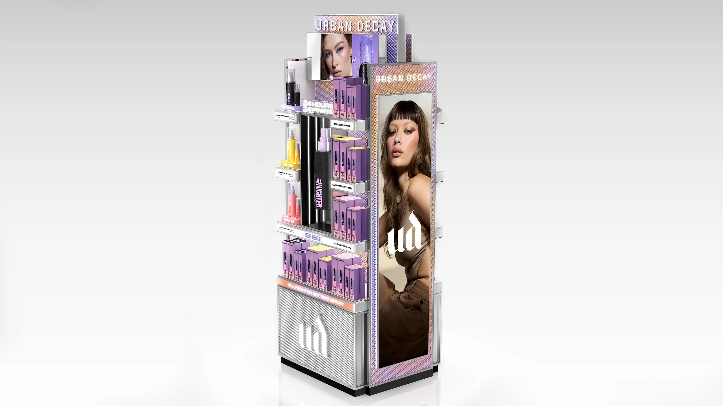
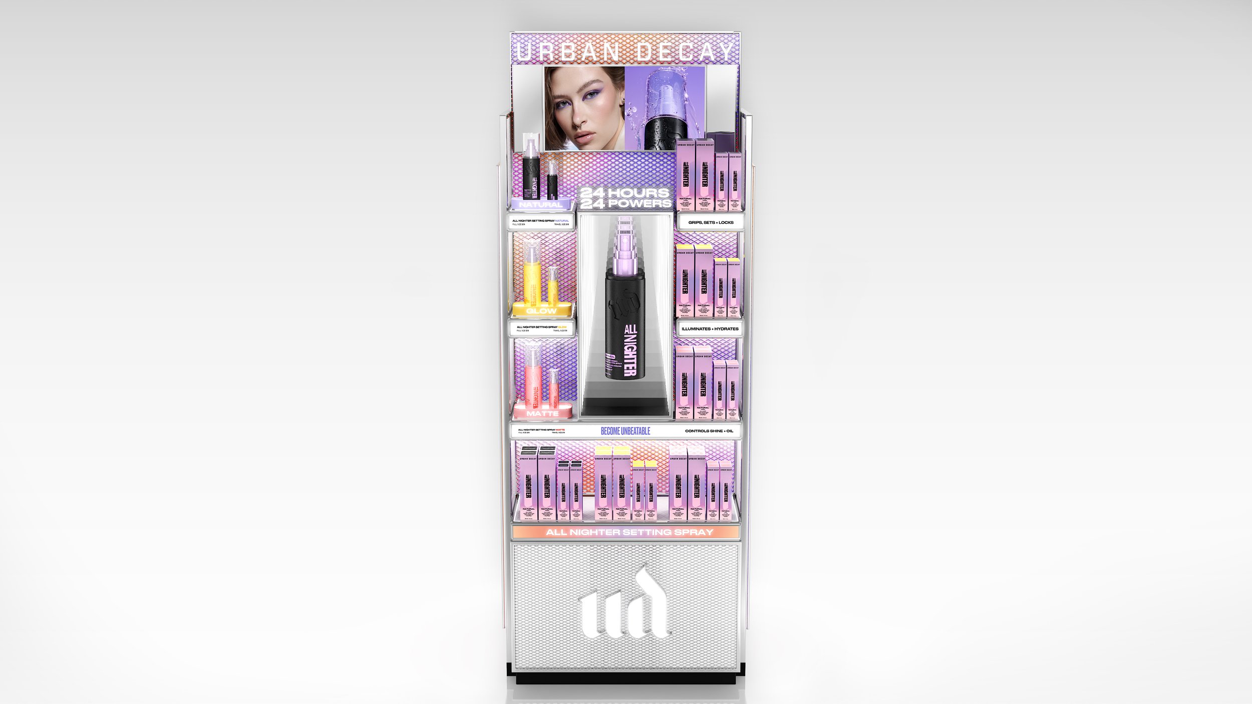
Urban Decay’s new visual rebrand reestablished the brand as a bold, LA-born authority in self-expression, performance, and anti-bland beauty, grounded in its “Born to Perform” mantra. As part of the global creative team, I helped translate this refreshed identity into cohesive merchandising systems by developing the templates, guidelines, and visual frameworks that directed execution across markets. Rather than designing each individual in-store element, I helped create the foundational tools that empowered both domestic and international teams to implement the new look consistently and powerfully. My work ensured the evolved brand vision was cohesive, adaptable, and clearly articulated across diverse retail environments worldwide.
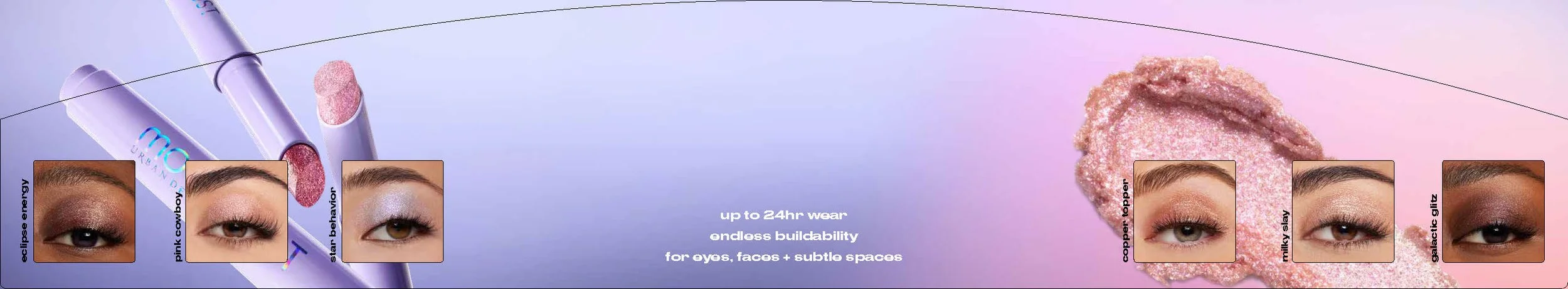
This display is an example of the new global Endcap I worked on, bringing the evolved brand identity to life through cohesive storytelling, graphics, elevated product presentation, and the introduction of the brand’s new vibrant color palette.

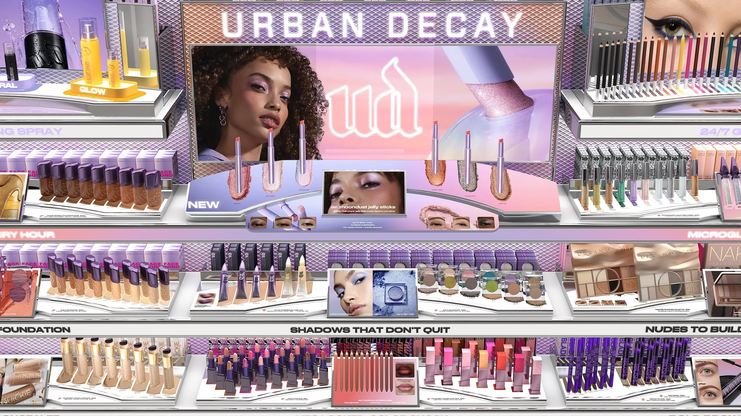
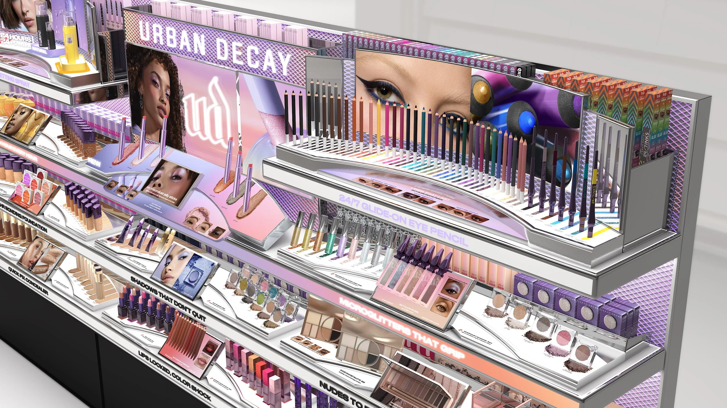
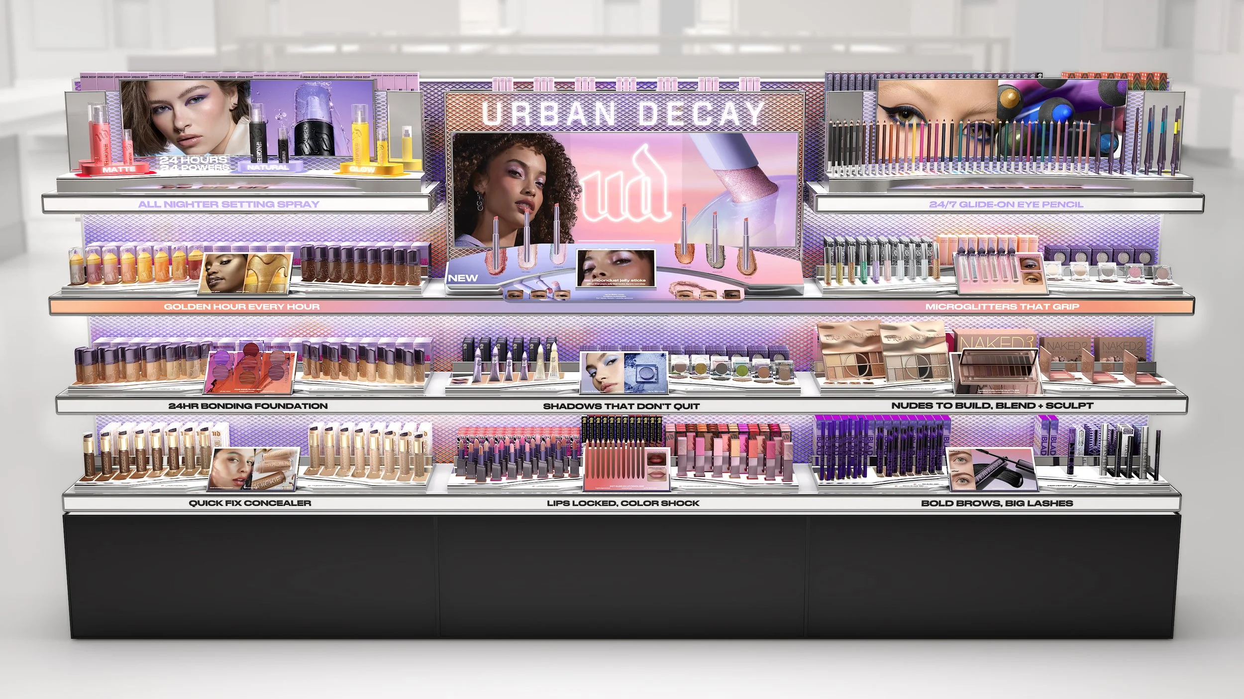
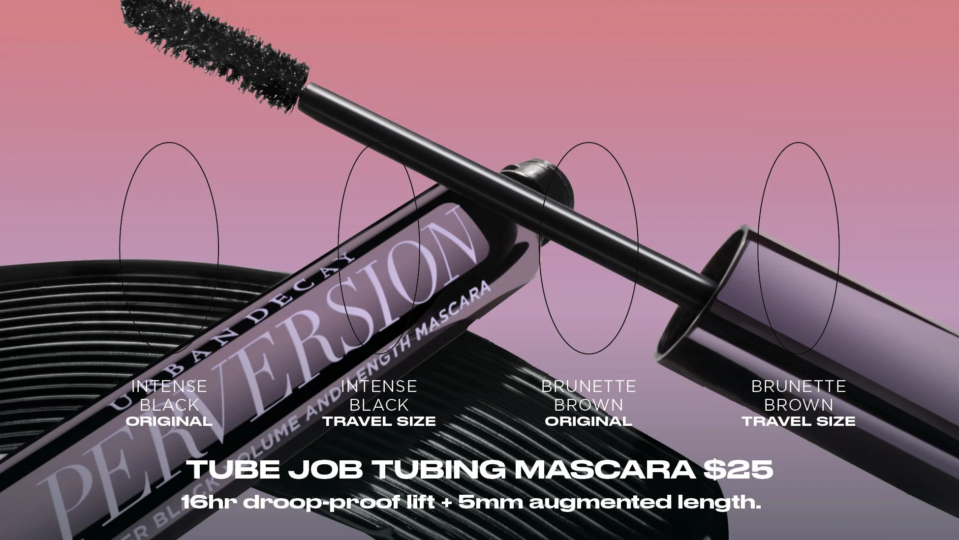
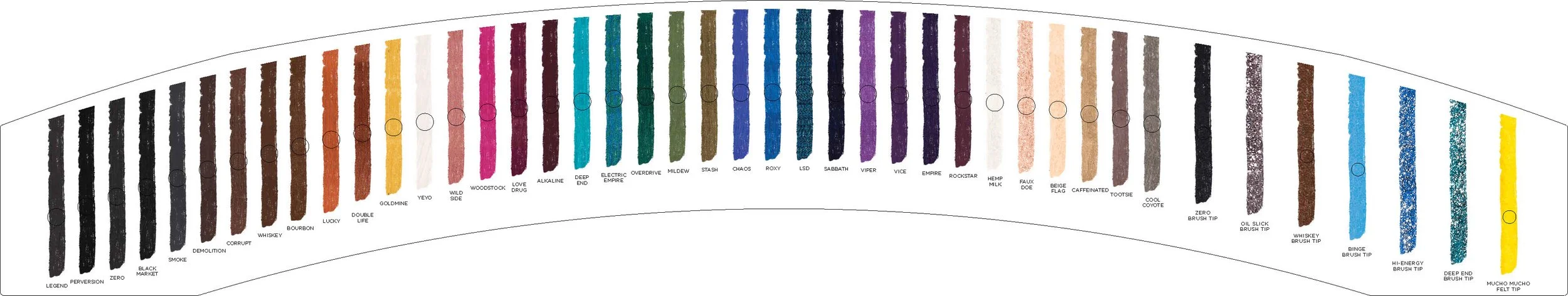
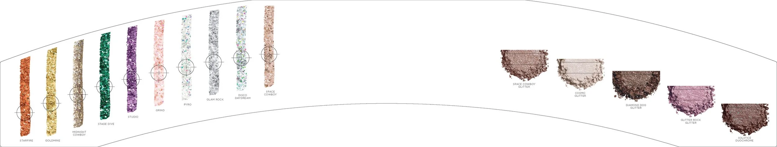
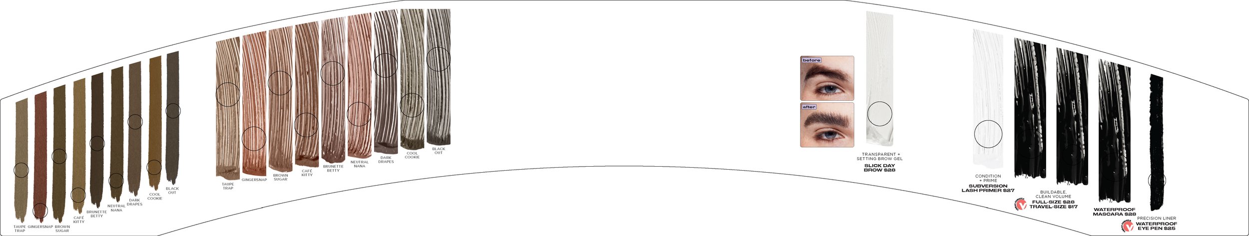
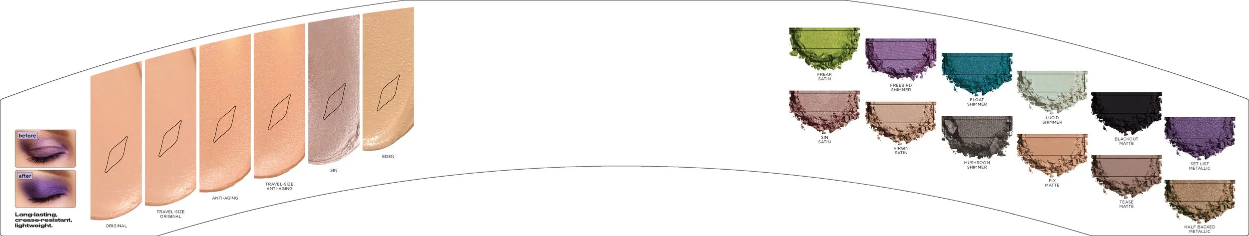
SCHEMATICS
These are examples of the schematics created for Endcaps such as this one and for other similar merchandising displays, outlining precise layouts, graphic placements, and product zoning. These schematics serve as the foundational templates and building blocks for global teams, ensuring consistency, accuracy, and brand integrity when executing graphics and adapting the display across the diverse retail environments worldwide.
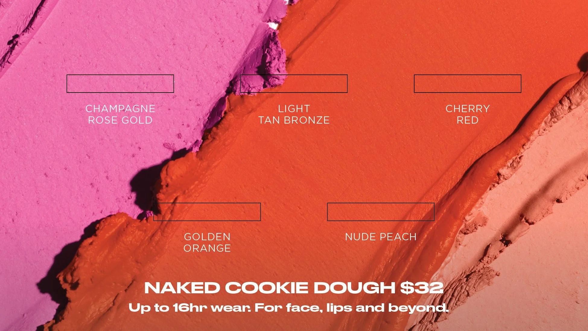
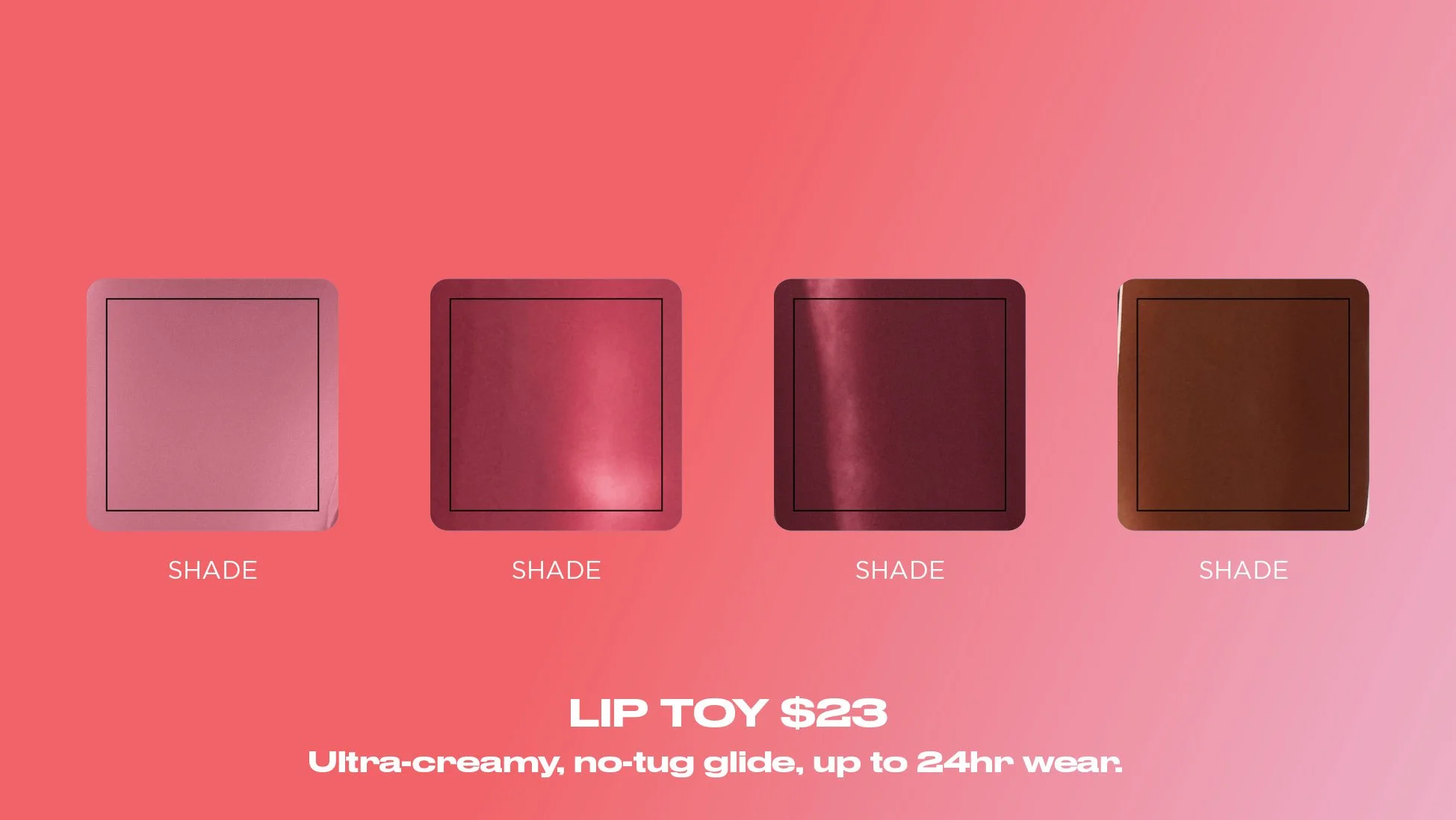
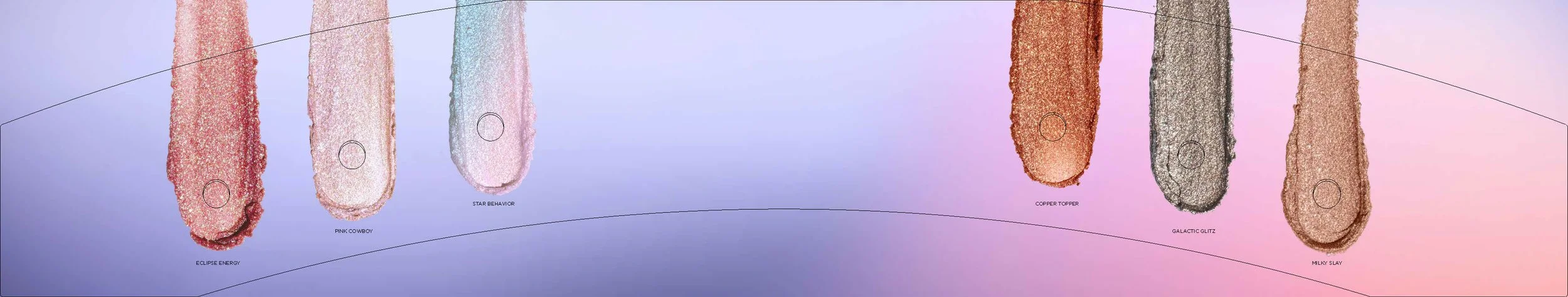

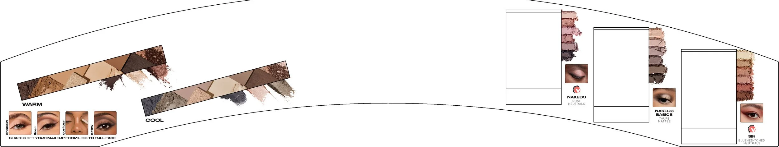
ALTERNATE DISPLAYS
As part of Urban Decay’s global rebrand, I helped develop graphics and adaptable design templates for alternate retail displays, integrating the refreshed brand identity across multiple formats. I translated updated visual guidelines into flexible, production-ready assets that domestic and international teams could tailor to their specific market needs and store environments. Most importantly, these templates maintained global brand consistency while empowering localized execution and creative adaptability.